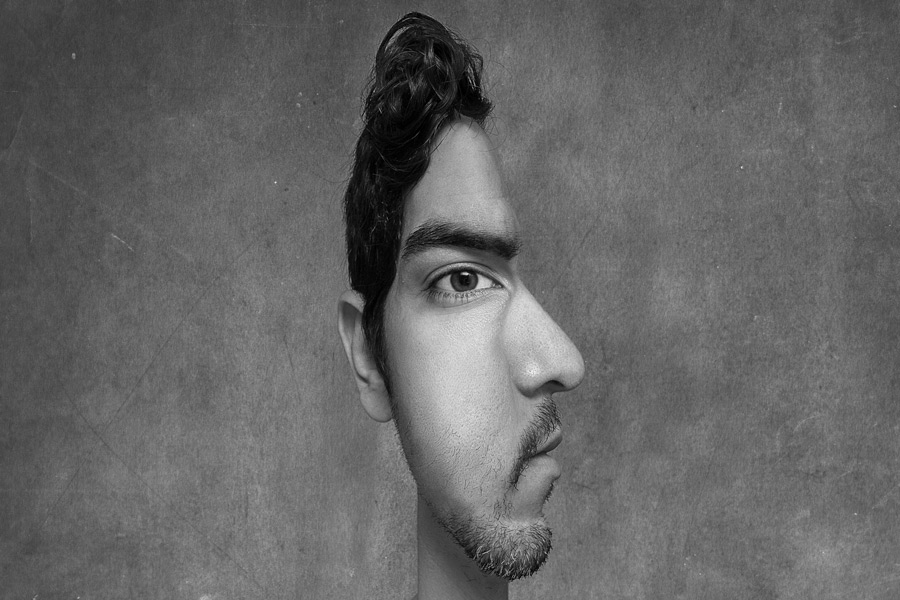
I get a lot of inspiration and ideas from 500px, as is the case with this week’s photo. While thumbing through popular photos, I came across This Image created by Alexey Oborotov and flat-out wanted to create my own. Just being honest.
On to the lighting…

I went with a simple lighting setup to make it seem more natural – one speedlight aimed at the ceiling in front of me. This created a large softbox above (and in front of) me and provided good contrast and as well as shadows under the eyebrows/chin. I ended up using only two photos to make this image – one head on shot and one profile (side) shot –


I know that I wanted the final result in black and white, so I mostly worked on it in Black and White by adding an Hue-Saturation Adjustment Layer and turning the saturation all the way down. I could easily hide this layer if I wanted to see the color version as I was editing.
Combining the two photos involved stacking one on top of the other (so there are two layers), lining them up (which I do by reducing the opacity of the photo on top and moving it where it best fits), and begin masking areas out. A lot of this is trial and error, hiding and revealing (blending) until it looks right. this is what the two photos looked like on their own –

After I had the main foundation done, I went ahead and did some dodging and burning, adding a few textures to the background, and threw on a High Pass Filter to finish it off. Boom, done.