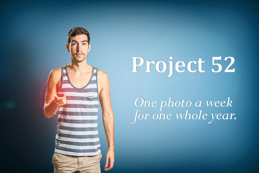
To start things off, I thought I’d do a BTS (behind the scenes) of the Project 52 Promo Photo.
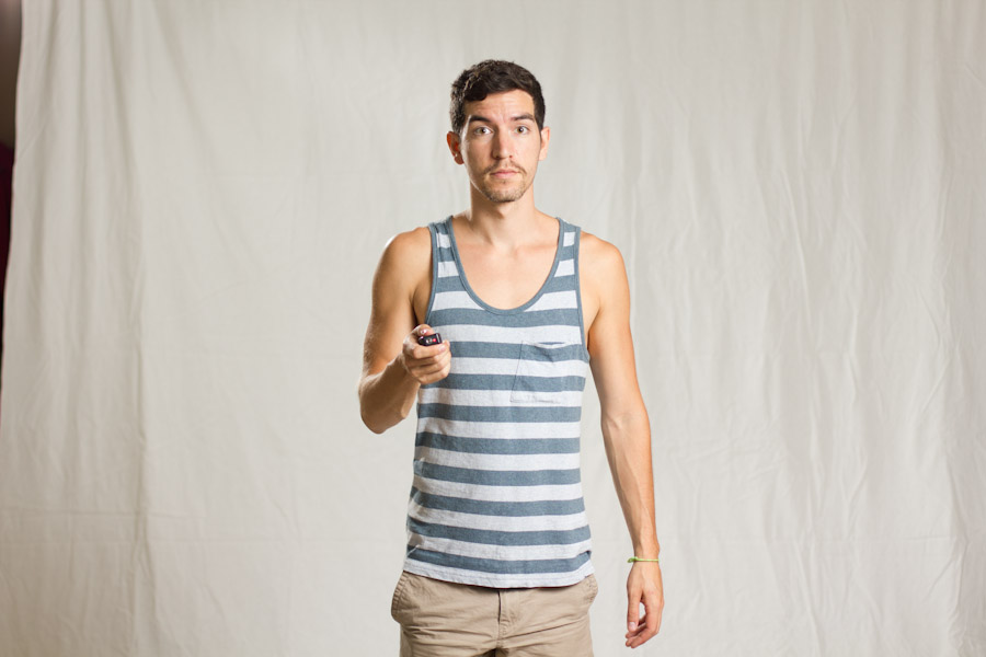
This image was pretty simple to create, though it required creating a blue background from scratch because, unfortunately, I don’t have an awesome blue wall like that where I live. I did, however, have a simple white (very wrinkled) backdrop to make it easier to cut myself out in photoshop. Here’s the original image –
And here is a lighting diagram to show you what I used and where it was placed –
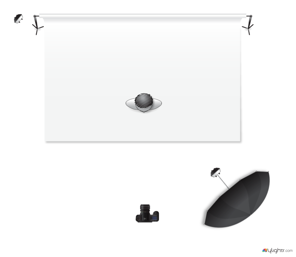
As you can see it’s a fairly simple lighting setup – I had a Canon 430ex Speedlight firing off into a 60in soft/white umbrella off to camera right in front of the subject (me), and another Canon 430ex Speedlight off to camera left behind the subject (me) giving me a bit of a rim light.
I’m shooting with a Canon T2i through my 50mm f/1.4 lens, and my settings were 1/200th sec, f/2.0, and ISO 100. In the future, I plan to shoot at a smaller aperture (f/8 or so) because this image wasn’t as crisp as I’d like it to be. Why these settings? Well, I try to shoot with the highest ISO that I can to get the best quality image, hence the ISO 100. 1/200th of a sec is the fastest shutter speed that will sync with my triggers/flashes, and I wanted to kill the ambient as much as possible. I didn’t really have a good reason to shoot at f/2.0, other than I was about to shoot my cousins doing jumps in the air and wanted to make sure my shutter speed was as fast as it could be, and that my ISO was high. Sometimes you have to suffer in one area to get what you want out of the others…
I don’t plan on posting light settings or distances from the subject because it’s all relative to where you are and what you have around you. For instance, for this shoot I had a low white ceiling just overhead of me, so I’m sure it was bouncing some light (unintentionally) from the large umbrella. There also may have been some ambient light coming from the windows at camera left, though I believe I killed most of it with my lights. And chances are that you don’t have the same exact gear as me, and if you were to recreate this setup based on every setting I told you, it’d probably come close, but there’s no sense in getting too detailed if it’s not the exact same gear and the exact same layout. Let’s put it this way – I feel that the placement of the lights and the type of light is important, but you should just use what you have and play with your settings until you find something you like.
Just filling the background with one solid color and photoshopping myself in front of it doesn’t look that pleasing, so I’ve been practicing creating walls like this for a while now to make them seem more realistic. This involves creating a variety of different layers (radial gradient, linear gradient, soft white or black brush, etc.) and playing around with the blending modes (mostly soft light and overlay) to give it highlights and shadows. I also add a layer of noise so it doesn’t look so flat and clean (in other words, giving it a hint of texture). The result is as follows –

Cutting myself out is a pretty simple process using the Quick Selection Tool in Photoshop – you just paint over yourself and it magically selects you. Now, it’s not perfect, so you do have to zoom in and work on it for a couple minutes, but if you have a solid color background it will work a lot better. Once I have that selection, I create a layer mask which allows me to add or take away any details I may have missed or want to get rid of (non-destructively).
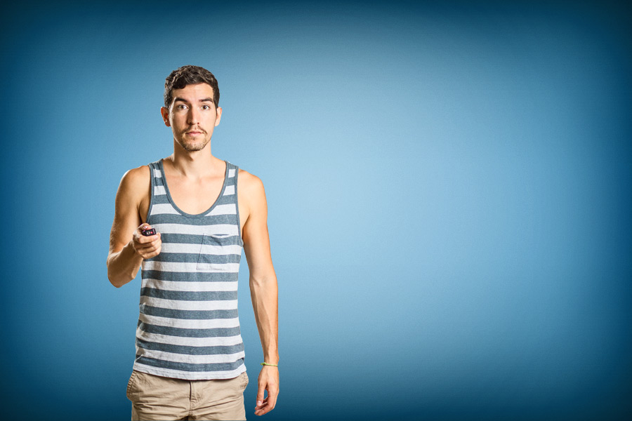
After I place the subject on the background, the next step is to do everything I can to make it look realistic. This includes adding a shadow on the wall behind me, as well as enhancing the red light coming from the trigger (that I’m holding in my hand). For the shadow, the most important factor is that it matches your lighting!! So, because I had a large light source in front of me on camera right, I created a soft shadow behind me on the wall to camera left. I prefer to make a copy of myself, add a drop shadow, and take the layer Fill to 0 to make sure the edges or the mask aren’t overlapping. I duplicate this layer and create multiple shadows that are the same distance away from me, but are different in size, spread, and opacity. To enhance the red light, I started with a layer of lens flare, played with the hue of the lens flare by making it more red, and added multiple layers of a soft red brush with different sizes and opacities. Both of these give depth and space to the photo, and help to blend me in to my surroundings.

Finally, I added some text and created a high-pass filter with the blend mode set to Overlay to make the image pop a little more!
Boom, done. Week 0 is in the bag. I’m very excited for the weeks to come, feel free to ask any questions or leave comments on my blog or through email.
Until next week,
-Rob Rice